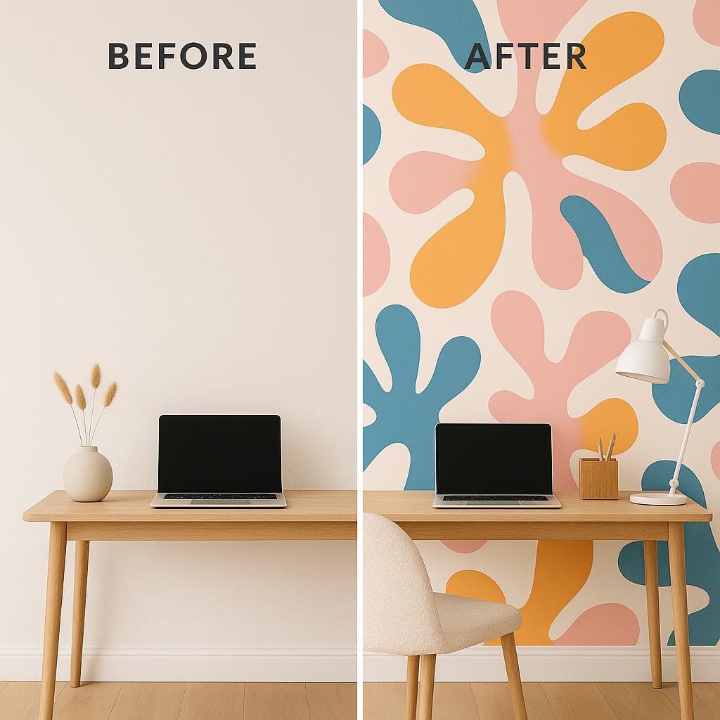
Let’s be honest: blank walls are boring.
But jumping into a bold wallpaper? That can feel... risky.
If you’ve ever scrolled past those jaw-dropping interiors with playful shapes and vibrant colors and thought, "I love it, but I could never pull that off", this post is for you.
We’re taking a closer look at this colorful abstract wallpaper – inspired by the iconic cut out art of Henri Matisse – and breaking down how you can make it work in real life homes.
No interior design degree needed.
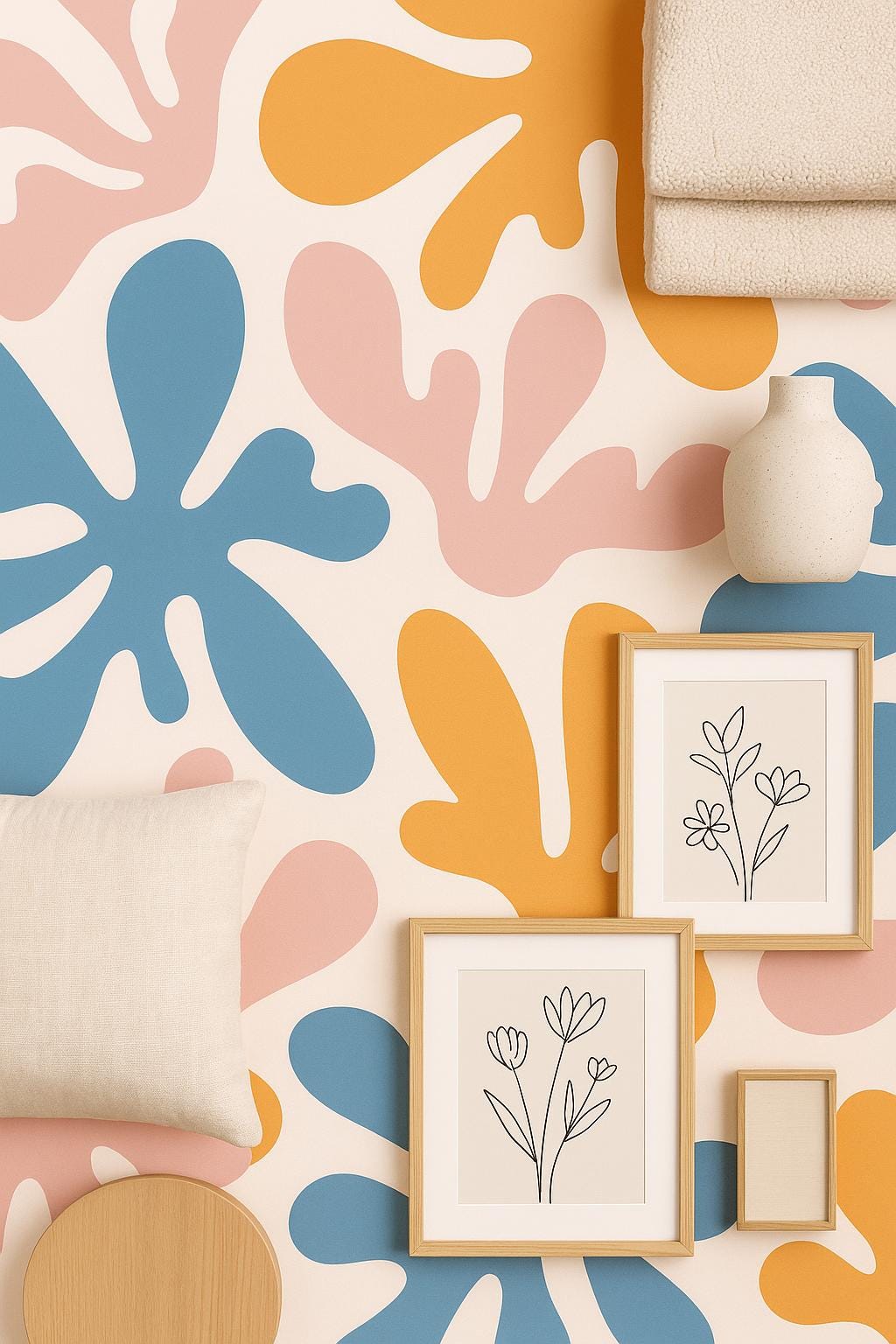
💡 Why This Pattern Works
This wallpaper is fun without being chaotic.
The shapes are organic, the palette is warm and balanced – think mustard yellow, coral pink, and slate blue on a soft cream background.
It’s artistic, modern, and adds personality instantly.
What we love most? It doesn’t take itself too seriously.
It’s art for your wall that feels lighthearted and uplifting – perfect for people who want to bring more joy into their space.
🛋️ Best Rooms to Use It In
Here’s the truth: you don’t need a huge space or an Instagram famous house to pull this off. This pattern looks amazing in:
- Living rooms – especially as a feature wall behind the couch
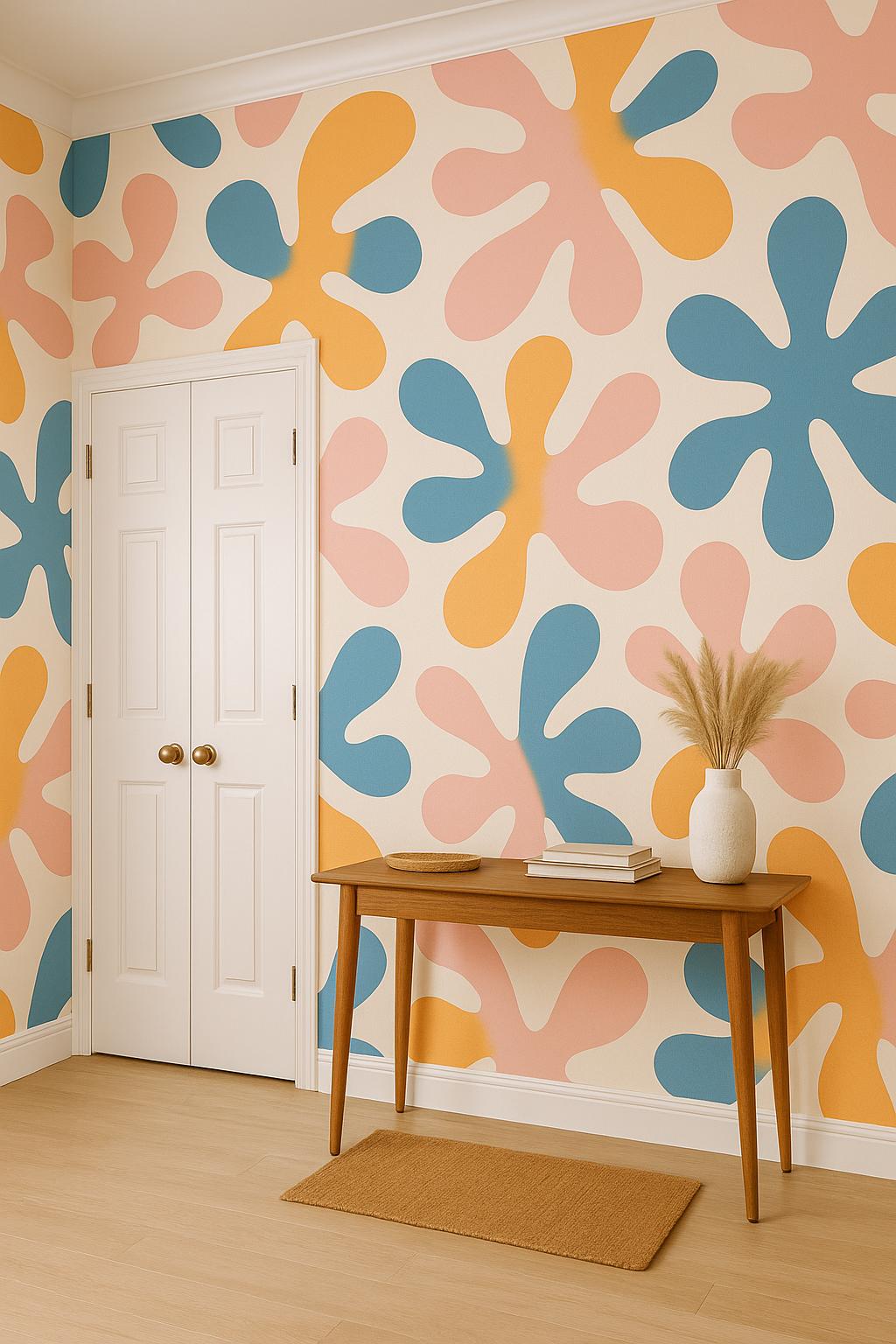
- Entryways – because first impressions count
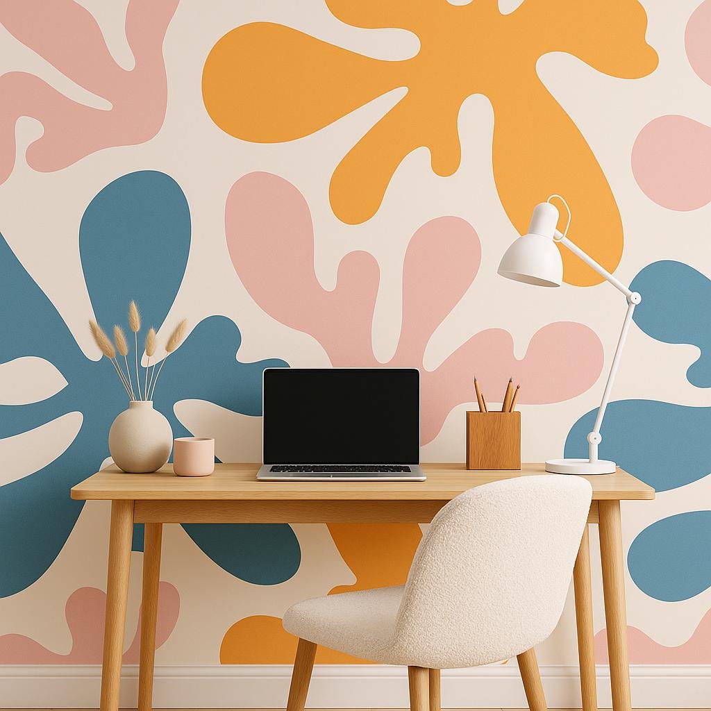
- Home offices or studios – it brings creative energy into your workspace
- Kids’ rooms or teen bedrooms – playful, cool, and unique
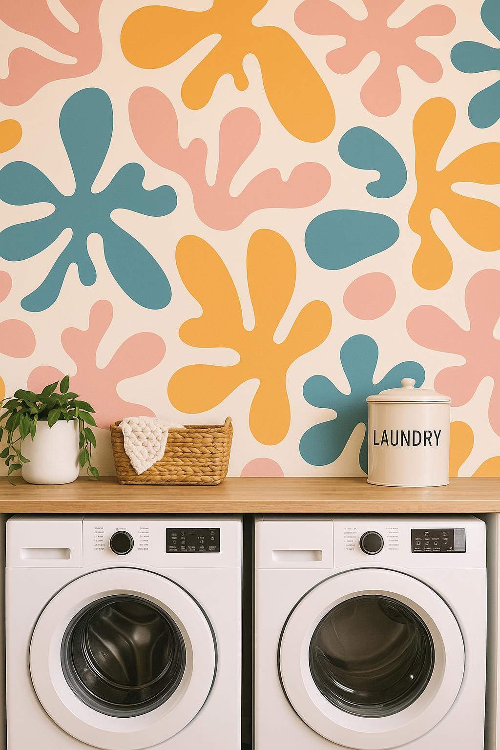
- Bathrooms or laundry rooms – small space, big statement
It also looks great in unexpected places – the back of a bookshelf, inside a closet, or even on the ceiling (yes, really).
🏠 What Style Does It Fit?
This wallpaper plays well with a few different aesthetics:
- Modern / Contemporary – especially with neutral furniture and minimalist decor
- Mid-century modern – pair it with walnut or oak tones and rounded shapes
- Scandinavian – clean lines, natural materials, cozy textiles
- Creative eclectic – if you like bold, artsy vibes, this is your jam
If you’re into color but don’t want to go full rainbow, this pattern is your sweet spot.
📏 Small Space or Big Space?
Both! In a small space, it acts like a piece of art – drawing the eye and making the room feel intentional. In a large room, it adds movement and energy – just be sure to balance it with calmer elements (think white walls, soft textiles, clean-lined furniture).
🧵 What to Pair It With
To avoid visual overload, let the wallpaper be the star and support it with:
Furniture:
- Light wood tones (oak, ash, birch)
- White or off-white sofas/chairs
- Rounded shapes and soft edges
Textiles:
- Neutral linen or cotton
- Muted terracotta or sage green accents
- Woven rugs or boucle textures
Decor:
- Large, minimal art pieces or black and white line drawings
- Glass, ceramic, or matte vases
- A few playful elements (like sculptural lamps or funky trays)
🧠 Tips Before You Commit
- Order a swatch. Seriously. Put it on the wall and live with it for a few days.
- Start small. Try one wall or a contained space before going all-in.
- Renter? Use the peel and stick version – no damage, all drama.
- Lighting matters. This pattern loves natural light, but warm artificial light also brings it to life.
🛒 Final Thought
Bold wallpaper doesn’t have to mean bold mistakes. With the right placement and balance, this abstract pattern can turn your space from basic to brilliant – without feeling overdone.
Whether you’re craving more color, creativity, or just a little extra joy at home, this design brings it without the stress.
✨ Ready to try it? Grab a swatch, trust your eye, and go for it.